You will get WordPress responsiveness optimization — mobile layout fixes, breakpoint tuning, and cross-device QA
Project details
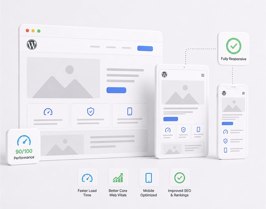
Your desktop site looks fine but mobile visitors see overlapping text, broken menus, horizontal scroll, or forms that are hard to tap. We audit key templates on phone and tablet breakpoints, fix CSS and builder settings, and QA navigation, CTAs, and forms across common devices. Scope depends on page count, theme/builder stack, and how many templates need work — pricing starts at $499. Request a quote and we confirm page volume and turnaround before work starts.
Service Type
WordPress Responsiveness
Best For
Broken mobile layouts, Elementor overflow, menu issues
Platform
WordPress, Elementor, common themes
Pricing
From $499 — quoted by page volume
Access needed
wp-admin, staging, or SFTP
Frequently asked questions
WordPress responsiveness optimization starts at $499 for a focused mobile fix pass on a small set of templates. Final price depends on page count, theme or page-builder complexity, and how many breakpoints need work. Request a quote with your URL and we confirm scope and pricing within one business day — no open-ended hourly billing.
Common fixes include overlapping text and images, horizontal scroll, broken hamburger menus, columns that stack incorrectly, forms and buttons that are too small to tap, tables that overflow the viewport, and hero sections that crop or hide CTAs on phones. We focus on layout and usability — not a full redesign.
Yes. Many responsiveness problems come from Elementor section padding, column widths, hidden-on-mobile settings, or custom CSS fighting the builder. We tune builder controls first, then add targeted CSS where the theme or plugin stack requires it.
The $499 starting point covers a scoped pass on your highest-traffic templates — typically homepage plus one or two key landing or service pages. Additional templates, blog archives, WooCommerce views, or location pages are quoted based on volume. We list exactly which URLs are in scope before kickoff.
Speed optimization targets load time and Core Web Vitals — caching, assets, and server configuration. Responsiveness optimization fixes how the layout behaves on phone and tablet — breakpoints, overflow, menus, and tap targets. Slow and broken mobile are different problems; many sites need one or both.
We test desktop and mobile after changes. Responsive fixes should use breakpoint-specific rules or builder settings so desktop styles stay intact. If we find theme-level issues that need a parent-theme update, we flag that before expanding scope.
Click Request a quote in the sidebar, share your website URL, describe what's wrong on mobile, and note approximate page count if you know it. We reply within one business day with a fixed quote and delivery window for your volume.
What our clients say:
CC
Clutch Client
Website Redesign & Dev for SaaS Company
★★★★★
"Icebreaker's technical knowledge and problem-solving attitude stand out.\n\nIcebreaker redesigned a SaaS company's website. The team migrated the client's old content, created modules and containers, and set up content and images.\n\nThanks to them, the client reduced their maintenance work by 80% and increased their website engagement rates. Moreover, the team delivered on time and responded quickly to the client's needs. Overall, the vendor's technical knowledge stood out."
Icebreaker's technical knowledge and problem-solving attitude stand out. Icebreaker redesigned a SaaS company's website. The team migrated the client's old content, created modules and containers, and set up content and images.
MS
Matthew Smith
Event Manager at DNA Events & Travel
★★★★★
"Using Dmitry and the Icebreaker team was a game-changer. They completed the project incredibly quickly, went above and beyond to deliver exactly what we needed, and ensured our website achieved outstanding results on Google's PageSpeed Insights. The final design is honestly the best I've seen. We couldn't be happier with the outcome!"
Using Dmitry and the Icebreaker team was a game-changer. They completed the project incredibly quickly, went above and beyond to deliver exactly what we needed, and ensured our website achieved outstanding results on Google's PageSpeed Insights. The final design is honestly the best I've seen.
UP
Upwork Client
Website Developer for PSD to Pixel Perfect site for a VERY particular client!
★★★★★
"Video Testimonial here: https://youtu.be/M8-K37N93MM Dmitrii Bilcenco is the BEST freelancer I have worked with in 25 years of business — and I mean overall, not just for this project. He does OUTSTANDING work, goes above and beyond to make sure you are satisfied, and follows through on EVERY commitment. This job was unusually difficult, yet Dmitrii stuck with it without complaining or asking for more money like other freelancers might bail. He was ALWAYS on schedule and worked so quickly I couldn't keep up reviewing everything. He is dedicated, creative, communicative, talented and a true JOY to work with. I HIGHLY encourage you to work with Dmitrii."
Video Testimonial here: https://youtu.be/M8-K37N93MM Dmitrii Bilcenco is the BEST freelancer I have worked with in 25 years of business — and I mean overall, not just for this project.
UP
Upwork Client
Website Designer/Developer Needed to Create Wordpress site using Rhodos Theme & Elementor Pro
★★★★★
"If you're developing a Wordpress site, stop searching Upwork right now and reach out to Dmitrii. You won't regret it! As a former VP of marketing for a $20 million tech company, I've worked with a lot of website developers. Dmitrii is top-notch. When it comes to building a Wordpress website, he is my new go-to person. He hits the sweet spot of: 1) Offering fair pricing and amazing value; 2) Technical expertise; and 3) Responsive communication throughout the entire process. Communication is an intangible that often gets overlooked. Yet, is SO critical to a smooth experience. When reading other Upwork reviews before reaching out to Dmitrii, one of his customers wrote this, \"Don't negotiate with him, don't try to bargain him down, just pay whatever he wants. I GUARANTEE you will be ECSTATIC with the results.\" I decided to follow that advice and am indeed thrilled with the results. How FAST he was able to complete the website project stood out. I requested several edits to the design throughout the process. Dmitrii never once made me feel like I was being too picky or asking for too much. He really took ownership over the project by creating milestones in Upwork which I greatly appreciated. Regarding the timeline, he provided a very realistic estimate and then nailed it – the website was actually launched a few days before the original estimated date. He was incredibly proactive, providing frequent progress updates. I felt like I always knew exactly where the project stood. Finally, I feel that the final results speak for themselves! We have a beautiful website that looks very professional and accurately reflects our brand. Thanks, Dmitrii – we couldn't have done it so quickly and smoothly without you!"
If you're developing a Wordpress site, stop searching Upwork right now and reach out to Dmitrii. You won't regret it! As a former VP of marketing for a $20 million tech company, I've worked with a lot of website developers. Dmitrii is top-notch.
AK
Aaron Kalandarov
Web Design & Dev for Digital Solutions Company
★★★★★
"What stood out most about the company was their combination of technical expertise and strong client focus.\n\nIcebreaker designed and developed a website for a construction digital solutions company. The team built the site to represent the client's brand better and improve their UX.\n\nThe client's online presence improved, and they saw an increase in engagement metrics thanks to them. The team delivered a professional site with a clear value proposition. They were highly responsive, organized, and proactive in addressing the client's needs."
What stood out most about the company was their combination of technical expertise and strong client focus. Icebreaker designed and developed a website for a construction digital solutions company. The team built the site to represent the client's brand better and improve their UX.
AG
Alice George
Website Revamp for Nonprofit Org
★★★★★
"They were a wonderful team. I would work with them again.\n\nIcebreaker revamped a website for a nonprofit organization. The team added new pages, a gallery section, and a network of communities section to the site.\n\nThe revamped website exceeded the client's expectations. The team was organized and provided constant updates. The team was patient, delivered great suggestions, and held weekly meetings. Overall, they were happy to make further revisions, pleasing the client."
They were a wonderful team. I would work with them again. Icebreaker revamped a website for a nonprofit organization. The team added new pages, a gallery section, and a network of communities section to the site. The revamped website exceeded the client's expectations.
AN
Arno Nurski
Web Development for Video Production Company
★★★★★
Their soft skills were especially impressive as this is not always the case with developers.
Very clear communication, very flexible and patient.
AR
Artur Ratnieks
Web Development & UX/UI Design for Automotive Upgrades Co
★★★★★
"Icebreaker's creativity, fast response time, and ability to turn ideas into a better product than we expected stood out.\n\nIcebreaker designed and developed a website for an automotive upgrades company. The team was responsible for the site's UX/UI design, structure, functionalities, and responsiveness.\n\nTheir work increased the client's sales, website traffic, and the time users spend on the site. The team was creative, efficient, and communicative throughout the engagement. Moreover, the team was responsive to the client's requests and had a professional approach."
Icebreaker's creativity, fast response time, and ability to turn ideas into a better product than we expected stood out. Icebreaker designed and developed a website for an automotive upgrades company.
Satisfaction Guarantee
We stand behind our work with a 100% satisfaction guarantee. If you're not completely satisfied with the final deliverable, we'll give you your money back.