
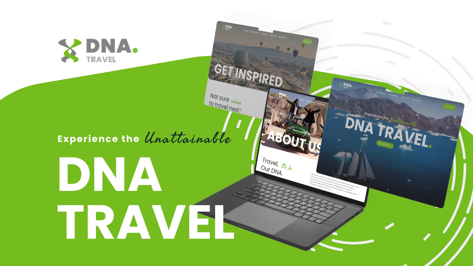
A boutique travel agency loses a six-figure incentive group to a competitor whose site shows three comparable packages, a clear "Plan this trip" inquiry asking for dates and headcount, and destination proof on the first scroll. The losing agency has beautiful photography, an Instagram feed on the homepage, and a Contact form that asks for a name and a message. The planner did not choose on aesthetics alone. They chose the agency whose process felt bookable before the first call.
That gap is the core problem in travel agency website design. Most agencies lose qualified trip inquiries because their site is built as a destination gallery with a contact form — not as a clear path from niche to offer to inquiry. Fixing that structure books better-fit clients than adding more photography or trying to out-price online travel agencies.
If you are an owner or director approving website budget, use this guide to score a current site or a vendor proposal: must-have sections, page types worth building, features that help versus features that are theater, wow that does not kill mobile speed, conversion architecture, and SEO/performance basics. Two related case studies are linked at the end as cards — not as the argument.
For the wider demand system around that website — SEO, landing pages, and measured lead generation — see our travel marketing agency services.
Why gallery-first travel sites lose inquiries
Search for travel agency website design and you will find trends lists, feature checklists, and agency pitches. Immersive imagery. AI itineraries. Booking engines. Multi-currency switches. The framing is written to sell websites to agencies, not to help you evaluate a proposal before you sign.
Brochure-style travel sites fail a simple decision test: can a stranger tell who you plan for, and what they should do next, without reading a 500-word About page? If the answer is no, the site is leaking demand regardless of how expensive the photography looks.
Owners feel this leak as "we get traffic but the wrong inquiries," or "Instagram is busier than the website," or "we redesigned last year and nothing changed except the hero video." Those symptoms point to architecture, not a missing trend feature.
Two false fixes show up constantly:
- Instagram as the website. Destination shots live on a feed you do not control. The owned site becomes a thin redirect with a contact form. When Instagram changes reach, your inquiry pipeline changes with it.
- Competing with OTAs on price. A booking widget does not fix unclear niche positioning. Visitors still do not know whether you are the right agency for incentive groups, luxury family trips, or destination management in a specific region.
Owners do not need another list of "must-have features." They need observables they can walk with a vendor before money moves.
Must-have sections for travel agency website design
Score the homepage and global navigation first. If these blocks fail, destination photography will not save the inquiry path.
Niche on the first scroll. A stranger should be able to say who you plan for — incentive groups, luxury families, adventure tours, DMC services in a region — without opening About. Pass: niche is in the hero headline or subhead. Partial: niche only in About. Fail: "Welcome to our travel world" with no buyer.
Trip-type or destination entry. High-consideration buyers need a mental filter immediately. Pass: nav and homepage expose destinations, trip types, or both within two clicks. Partial: one mixed "Explore" gallery. Fail: destinations only as Instagram embeds.
Featured packages or services. Show what you sell, not only where you have been. Pass: three to six concrete offers or service lines with links to dedicated pages. Partial: vague "Our packages" teaser with no URLs. Fail: photography only.
Proof near decisions. Testimonials and partner logos convert better next to package and destination CTAs than on a buried Reviews page. Pass: at least one trust signal beside a primary CTA. Fail: logo wall only on About.
Named inquiry CTA. "Plan this trip," "Request a proposal," or "Book a planning call" beats "Contact us." Pass: named CTA in header and above the fold on homepage. Fail: generic Contact in the footer only.
About and team trust. Planners still want to know who they are hiring. Pass: a clear About path with people or process. Fail: About is a wallpaper paragraph with no next step back to inquiry.
Walk a proposed sitemap against those six. Two or more Fails means you are buying a gallery, even if the mockups look expensive.
Page types worth building (and what to skip)
A strong travel agency site is a small set of page types done well — not a clone of an OTA catalog.
Destination pages. Dedicated URLs for the places you actually sell. They support organic entry points and give planners a shareable link for a specific destination. Pass: real destination pages with offer context and a CTA. Fail: destinations only as homepage tiles that open a lightbox.
Package or tour pages. Comparable offers with enough detail that a stakeholder can forward the URL. Pass: package pages with itinerary outline, who it is for, and inquiry CTA. Fail: "Packages coming soon" or PDF-only offers with no page.
Service-line pages. If you run leisure travel and corporate or events work under one brand family, treat that split as a first-class page and nav requirement. A conference planner should not land in leisure package photography with no path to the events side. Pass: explicit service architecture (for example travel vs events). Fail: one undifferentiated "What we do" blob.
Inquiry or consultation page. A dedicated path for the named CTA, with qualification fields you actually use. Pass: trip type, timing, group size, and enough budget signal to protect your calendar. Fail: name, email, message — then hope.
About. Credibility and process, then a return path to inquire. Not a dumping ground for every award.
What to skip (for most independents). A full self-serve booking megasite with inventory, multi-currency checkout, and OTA-style filters is only worth it if you sell high-volume, productized packages with fixed prices you can confirm online. Many agencies and DMCs sell complex trips that start with a conversation. For them, deep destination and package pages plus a strong inquiry path beat a half-implemented booking engine that never matches how you sell.
Features that help vs features that are theater
Ask one question of every feature in a proposal: does this help a stranger start a qualified proposal faster?
Features that help
- Browse paths by destination or trip type (filters or clear taxonomy) without requiring a full booking engine
- Shareable destination and package URLs for stakeholder forwarding
- Qualified inquiry forms (trip type, dates, headcount, budget band)
- Testimonials and proof placed beside package and destination CTAs
- Optional itinerary downloads or planning PDFs when they support a specific offer — not as a substitute for pages
Features that are theater
- Autoplay full-bleed hero video before niche or CTA is readable
- Instagram feed as the primary "portfolio"
- Booking widgets that cannot price or confirm how you actually sell
- Multi-currency switches, AI itinerary toys, and feature checklists that never define the inquiry path
- Carousels that hide offers behind five slides of mood photography
If a redesign proposal leads with theater and buries qualification fields in a footnote, you are approving decoration.
Wow without breaking the inquiry path
Travel is visual. Wow still matters — sequence matters more.
Immersive photography, destination storytelling, and restrained motion earn their place after niche, offers, and a named CTA are obvious on first scroll. Wow that arrives before those three is peer-impressing theater. Wow that arrives after them is sales infrastructure.
Travel sites are image-heavy by nature. That is fine until uncompressed galleries and autoplay media slow the page a planner opened on their phone between meetings.
In the Deloitte/Google study Milliseconds Make Millions, researchers analysed mobile site data across retail, travel, luxury, and lead-generation brands. Based on a 0.1-second natural mobile site speed improvement, travel conversions increased by 10.1% (with a smaller lift in average order value). Treat the exact percentage as directional evidence from that study, not a guarantee for your market. The direction is what owners should act on: mobile speed is a revenue input.
Write a performance budget into the scope: compressed destination imagery, measured mobile load targets, and no autoplay media until niche and CTA are clear. Speed discipline protects the niche → offer → inquiry path. It does not replace that path.
Conversion architecture for trip inquiries
Conversion architecture is how quickly a fit visitor can start the conversation you want — usually a qualified inquiry, not a vague "hello."
Named next step. Pass: "Plan this trip" or "Request a proposal" in the header and on destination/package pages. Fail: "Contact" only.
Qualification fields. Collect trip type, dates or season, headcount, and a budget band or floor before the call. Pass: fields your team actually uses to accept or decline. Fail: name, email, blank message.
Proof beside the ask. Place a short testimonial or relevant client line next to the CTA on offer pages. Pass: trust at decision points. Fail: Reviews page only.
Dual-brand clarity. If leisure and corporate/events share a brand family, navigation must make the vertical obvious before the form. A booking engine does not fix that confusion.
When a booking engine is warranted. High-volume, productized packages with fixed inventory and confirmable prices can justify self-serve checkout. Consultative agencies and DMCs usually need inquiry clarity more than OTA theater. Do not pretend a contact form is a booking flow — and do not buy a booking flow when your sales process is a proposal.
SEO and performance for travel agency websites
This article stays on website structure. Broad travel marketing and lead-gen strategy belong in a separate industry playbook. Still, a few SEO and performance requirements belong in every redesign brief because they are inseparable from the page types above.
Destination and package landing pages. Dedicated URLs create organic entry points beyond the homepage and give planners something to share. Thin homepage tiles with no crawlable pages waste both search and sales.
Page experience and Core Web Vitals. Google treats page experience — including Core Web Vitals — as part of its ranking systems. Commonly cited "good" thresholds include Largest Contentful Paint at or under 2.5 seconds, Interaction to Next Paint at or under 200 milliseconds, and Cumulative Layout Shift at or under 0.1. Page experience alone will not rank you. Unoptimized media that harms those metrics will still undermine both visibility and the inquiry path you paid to design.
Image basics. Descriptive filenames and alt text on destination photography; avoid dumping IMG_4521.jpg into every hero. Image SEO will not save a site with no niche statement — but it is free structure once the IA is right.
What not to buy as "SEO" in a design scope. A content calendar of generic travel tips before destination and package pages exist. Fix offer architecture first.
How to approve website budget
Walk your current site or a proposed sitemap and score each row. Two or more Partial scores, or any Fail on niche, offer pages, or inquiry, means you have a structural gap — not a cosmetic one.
| Requirement | Pass (observable) | Partial | Fail |
|---|---|---|---|
| Niche on first scroll | Who you plan for is clear in hero | Only clear in About | Generic welcome / mood copy |
| Offer architecture | Destinations, packages, or services browsable in two clicks | Mixed gallery with weak labels | Photography only |
| Page types | Destination + package/service URLs exist | Teasers without dedicated pages | Homepage-only site |
| Named inquiry | Specific CTA + qualification fields | Named CTA, weak form | Generic Contact only |
| Proof beside CTAs | Testimonials near offer decisions | Proof on About/Reviews only | No proof |
| Dual-brand clarity | Travel vs events (or equivalent) split in nav | Ambiguous mega-menu | One undifferentiated gallery |
| Performance budget | Mobile speed targets + compressed media in scope | Mentions mobile, no metrics | Autoplay hero, no budget |
| SEO foundations | Crawlable destination/package pages + image basics | Blog promised before offer pages | No landing pages planned |
When those rows Pass, you are buying inquiry architecture. When they Fail, you are buying a gallery — even if the mockups look expensive.
Icebreaker builds conversion-focused sites for travel agencies and DMCs on stacks like WordPress and Elementor when the information architecture is designed first. If you are scoping a rebuild, start from web design for service businesses and CMS development with this scorecard written into the brief.
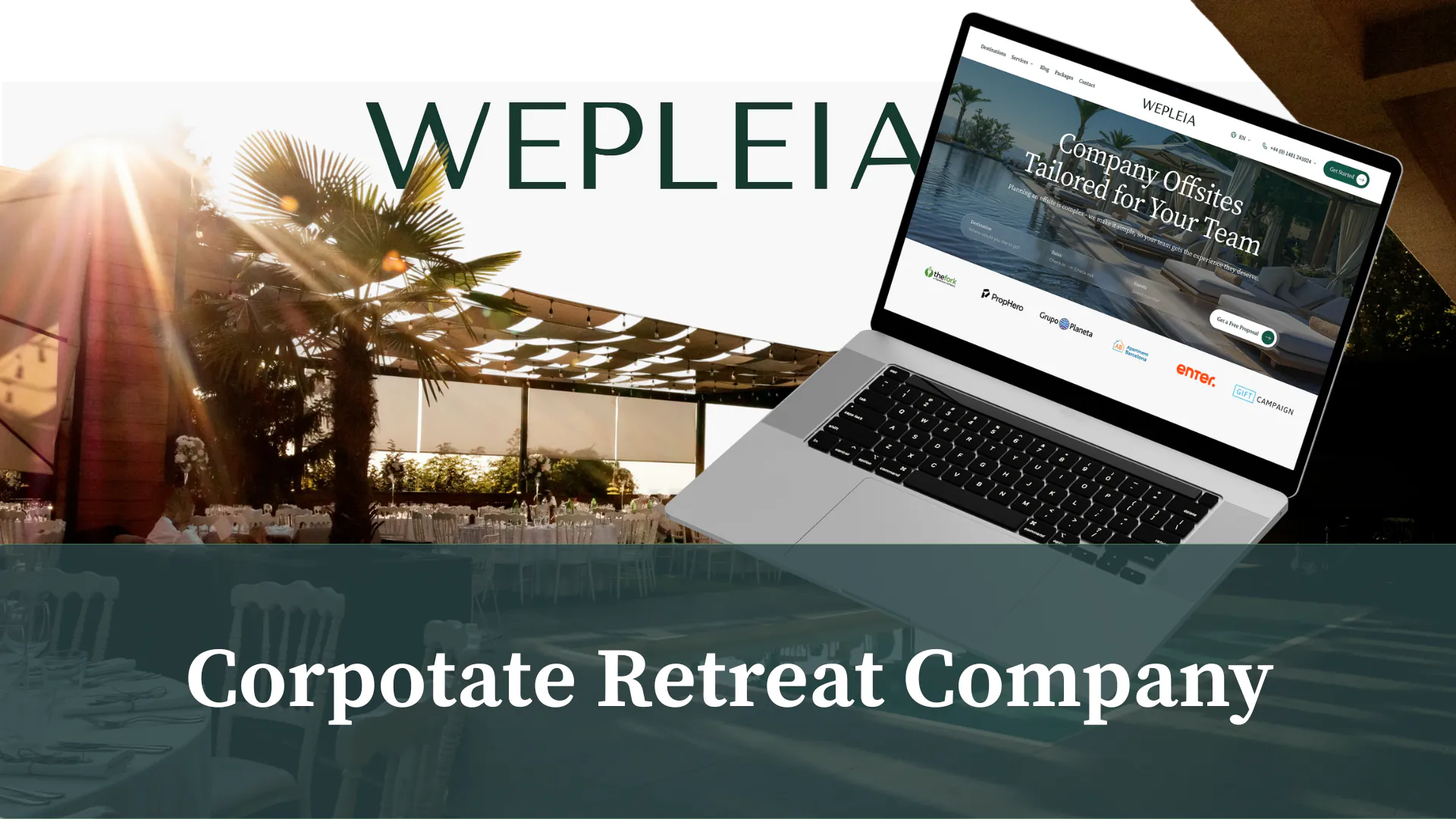
What this looks like in production
Frequently asked questions
What should a travel agency website include?
At minimum: a clear niche on the first scroll, browsable destination or package pages, a named inquiry path with qualification fields (trip type, dates, headcount, budget band), proof beside CTAs, and a performance budget for image-heavy pages. That is the core of strong travel agency website design — not a hero gallery with a generic Contact form.
Do travel agencies need a booking engine on the website?
Only if you sell high-volume, productized packages with fixed prices you can confirm online. Many independent agencies and DMCs sell complex trips that start with a conversation. For them, destination and package pages plus a qualified inquiry form beat a half-built OTA-style checkout.
What makes the best travel agency websites convert inquiries?
The sites that convert make niche, offers, and next step obvious in under a minute. Planners can share a specific destination or package URL, see who you serve, and start a proposal with context already collected. Gallery-first sites that rely on Instagram or mood photography without that path lose qualified demand.
How does SEO fit into travel agency website design?
SEO foundations for this decision are crawlable destination and package landing pages, sensible image filenames and alt text, and Core Web Vitals that protect mobile research sessions. Broad travel marketing SEO belongs in a separate playbook — do not buy a blog calendar before offer architecture exists.
The position
Most travel agencies lose qualified trip inquiries because the site is a destination gallery with a contact form, not a path from niche to offer to inquiry. Approve website budget for must-have sections, the right page types, features that help a stranger start a proposal, wow that respects mobile speed, conversion fields you actually use, and SEO foundations tied to destination and package URLs. Photography comes after that path is obvious.